Tuesday, December 11, 2007

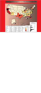
My final project


Site I got my data from

http://www.fbi.gov/ucr/cius2006/data/table_69.html


Sites that relate to my data

This chloropleth map shows homicide density in Washington D.C. from 1994-1995
http://www.ojp.usdoj.gov/nij/maps/images/bb2.gif

This chloropleth map shows homicide locations in D.C. from 1994-1995
http://www.ojp.usdoj.gov/nij/maps/images/bb1.gif

It's not a descriptive map, but this is supposed to show murders occurring in Papua New Guinea
http://www.papuaweb.org/goi/pp/peta-hr.gif

This is another map that isn't descriptive, but it shows homicide locations in Boston, Mass.
http://www.bpdnews.com/bpd_map_122105.gif

This is a map of the worst homicide locations in Baltimore, Maryland.
http://www.examiner.com/images/newsroom/Image/murder_map.jpg

Saturday, December 8, 2007

my final project


I'm going to do a chloropleth map next of my statistics

Thursday, December 6, 2007

Check this map out

http://www.alcoholpolicy.niaaa.nih.gov/
Minimum Age To Sell Beer for Off-Premises Consumption as of January 1, 2007 . So this is a map for where you can sell beer and at what age.

I thought this was a nice map


This is a map of freshwater use for 1990. I like the background tint a lot and the colors really show up clearly.

Source: water.usgs.gov

The 5 best maps that my classmates created

Extra Credit Assignment


Top 5 student's maps created


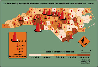
1. I thought this was the best map. The artwork that was displayed for making the cones could not be any better displayed. The color scheme for the chloropleth map is a very good one as the colors have a good overall pattern to them.


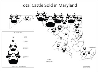
2. I like this map the second best because the drawing of the cows is very well done and even makes me laugh a little. I also liked this map since the overall layout is very unique, with a light gray circle highlighting the map and the gray becoming darker towards the edges of the map.


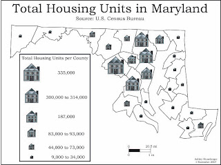
3. This is a great symbol map and I chose it for the 3rd best design because of the artistic creation of the houses. The townhomes look like actual townhomes it seems like. Another thing I like about this symbols map is that all the symbols fit inside the county boundaries.


4. I like the overall design of the bulls in this one. Yes it does cover the state boundaries and there is no background tint, but the art really sticks out to me.


5. I like this dot map because of the color applied to the counties. It makes the dots pop out much more so someone looking at it could be able to count them a lot easier. The grayscale background is also a nice addition


The Overall best Example Maps


1. I liked this map a lot since it goes over a topic I really like, which deals with war. They should show color on the map, which the person who is making the map is putting in it. It's a very interesting subject and I've never seen a map type like this one


2. I thought this touched on an interesting subject since oil is one of our worst economic problems in America at this point of time. This is a good type of map that the President could look at to determine if we really need to get oil from the Saudi's. It's a really good bivariate map which is very informative about the amount of oil around the world.


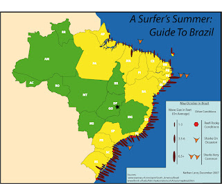
3. I love this type of map since I love the sport of surfing and there is so much work being put in to doing this. I also learned something about Brazil by looking at this map because I never knew it was such a good surfing location. It looks like in the Southern part of the country is where the best surfing occurs.


4. This is a funny map from Japan about how they view us. I put it as my fourth favorite map because it's interesting to see that they view us as being like the Middle East. I guess they have a bad view of George Bush and his policies towards this area.


5. I like this map since it shows an issue that is very common in this day and age, poverty in the U.S. The South looks to be having the highest numbers of poor people. There is a nice color scheme to this map and the reddish colors fits to the overall depressing subject of thought.


Tuesday, November 27, 2007

The bivariate map


Here is my bivariate map
Daniel

Tuesday, November 13, 2007

my color chloropleth


Here is my color chloropleth map. I did it on natural breaks. This is a good method for seeing patterns in data. Like for example how in the whole midwest, people spend much less time than anywhere else in the country by way of traveling to work. It's better than equal intervals in the way of trying to see patterns in the data since for equal intervals, this is a method used just to show a viewer specific data facts and not patterns.

Sunday, November 11, 2007

Hey who fishes,


I caught this rockfish in October. It's kind of small, 20 inches, but it was really filling when eaten.

Tuesday, November 6, 2007

My dot density map


Here is my dot density map. It was EXTREMELY TIME CONSUMING!!!!!

Tuesday, October 30, 2007

My proportion symbols map


Here is the proportion symbols map. It's about the number of cattle and calves sold in 1997 in each county in Maryland.

Friday, October 26, 2007

my chloropleths


My two chloropleth maps

Tuesday, October 16, 2007

Tuesday, October 2, 2007

My typography map


Here is my typography map. Here is also a website that shows a research study being done in England to determine the legibility of type in maps.

Monday, September 24, 2007

Mollyweide Graticule


This is a Mollyweide Graticule. The scale of it is 1:63,360. The lines at the meridian are rotated 360 degrees. This projection is a pseudo cylindrical equal-area projection with straight and elliptical meridians. The lattitudes and longitudes of the graticule are at 15 degree intervals. This is a projection of our Earth.

Tuesday, September 11, 2007

Geography sites

This is the U.S. geological survey site
http://www.usgs.gov/

This is the National Oceanic and atmosphere administration site
http://www.noaa.com/

This is the National Geographic site with many different types of maps ranging from world maps to street maps
http://plasma.nationalgeographic.com/mapmachine/

This site contains many different types of maps containing world maps, political maps, population maps and so on
http://www.atlapedia.com/

This site contains geography news from around the world.
http://geography.about.com/

Department of Geography in GMU
http://geog.gmu.edu/index.html

class blog website
http://geog310.blogspot.com/

Chloropleth map of the United States and illustration of a sphere, a geoid, ellipsoid and a natural surface


This is a Chloropleth map of the U.S. It is showing the population of males in the states compared to the number of 100 females. Nevada and Alaska have the highest concentration of males compared to females. Many east coast states tend to have the lowest concentration of males to females with females outnumbering males in most states.


This is my lab 2. The specific illustrations are labeled as shown