Top 5 student's maps created

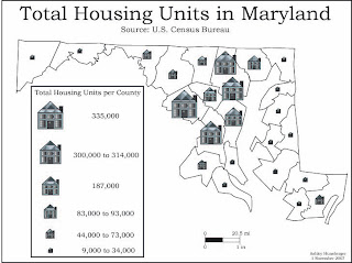
 3. This is a great symbol map and I chose it for the 3rd best design because of the artistic creation of the houses. The townhomes look like actual townhomes it seems like. Another thing I like about this symbols map is that all the symbols fit inside the county boundaries.
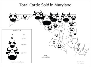
 4. I like the overall design of the bulls in this one. Yes it does cover the state boundaries and there is no background tint, but the art really sticks out to me.
5. I like this dot map because of the color applied to the counties. It makes the dots pop out much more so someone looking at it could be able to count them a lot easier. The grayscale background is also a nice addition
1. I liked this map a lot since it goes over a topic I really like, which deals with war. They should show color on the map, which the person who is making the map is putting in it. It's a very interesting subject and I've never seen a map type like this one
2. I thought this touched on an interesting subject since oil is one of our worst economic problems in America at this point of time. This is a good type of map that the President could look at to determine if we really need to get oil from the Saudi's. It's a really good bivariate map which is very informative about the amount of oil around the world.

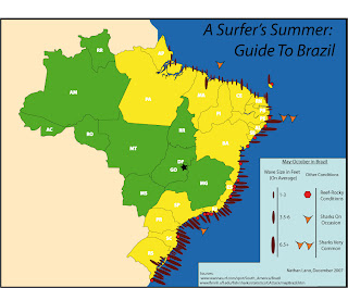
3. I love this type of map since I love the sport of surfing and there is so much work being put in to doing this. I also learned something about Brazil by looking at this map because I never knew it was such a good surfing location. It looks like in the Southern part of the country is where the best surfing occurs.
4. This is a funny map from Japan about how they view us. I put it as my fourth favorite map because it's interesting to see that they view us as being like the Middle East. I guess they have a bad view of George Bush and his policies towards this area.
5. I like this map since it shows an issue that is very common in this day and age, poverty in the U.S. The South looks to be having the highest numbers of poor people. There is a nice color scheme to this map and the reddish colors fits to the overall depressing subject of thought.


4 comments:
generic name of viagra homemade viagra herbal viagra viagra buy price iframe soma and viagra prescriptions free viagra viagra faq buying viagra online in britain buy online viagra free viagra without prescription uk viagra sales viagra commercial canyon filmed viagra dosages lowest price viagra instructions for viagra use
Your blog keeps getting better and better! Your older articles are not as good as newer ones you have a lot more creativity and originality now keep it up!
I want not approve on it. I assume precise post. Especially the appellation attracted me to be familiar with the unscathed story.
Amiable dispatch and this post helped me alot in my college assignement. Say thank you you seeking your information.
Post a Comment